top of page

Small Batch.
Delivery.


Delivery.
If your time poor, or just want to avoid the traffic, let us deliver to you.
Icon two is the Blakeaway delivery truck... or Jeep.
As with all three, I drew it on my Ipad with stylus pen.
I used stylised stroke options to imitate a brush that tapers off, highlights to imitate light and create depth and the brand colours to finish the job.
Location.
Location.
A one stop shop for all your last minute meals, homewares & hampers.
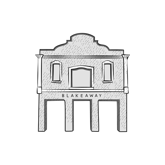
Icon three is the facade of their Abbotsford brick-and-morter store.
This one took the longest to perfect, despite what seems to be a lack of complexity. Sometimes simpler shapes and images that don't give enough to play with can be harder to, how do I say it? polish?
bottom of page